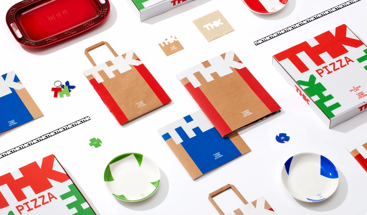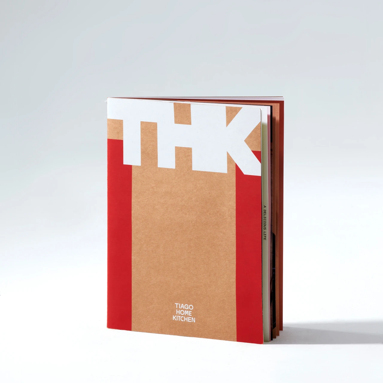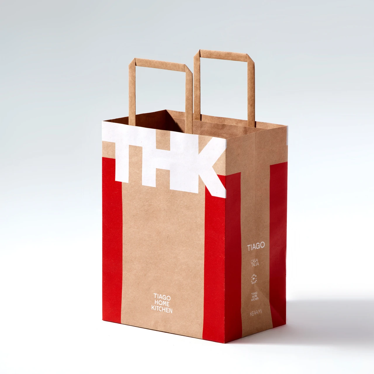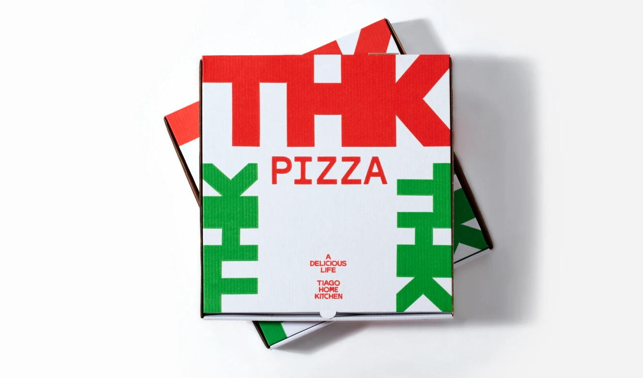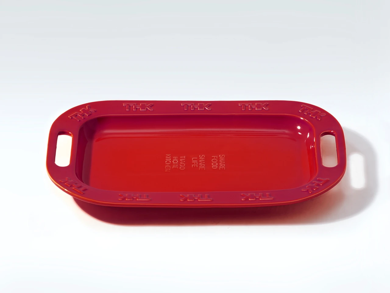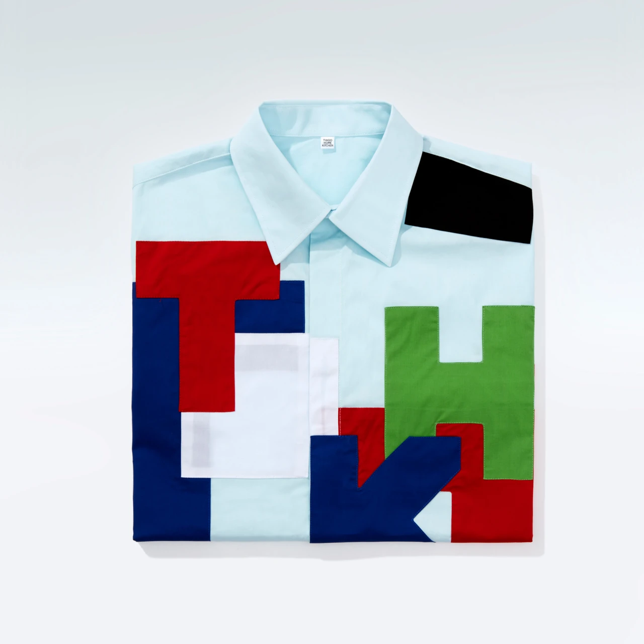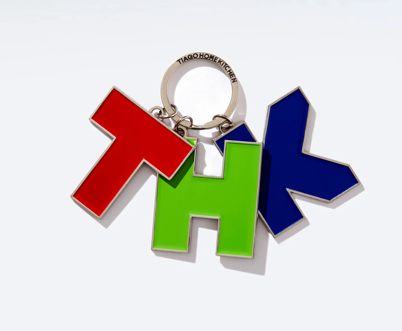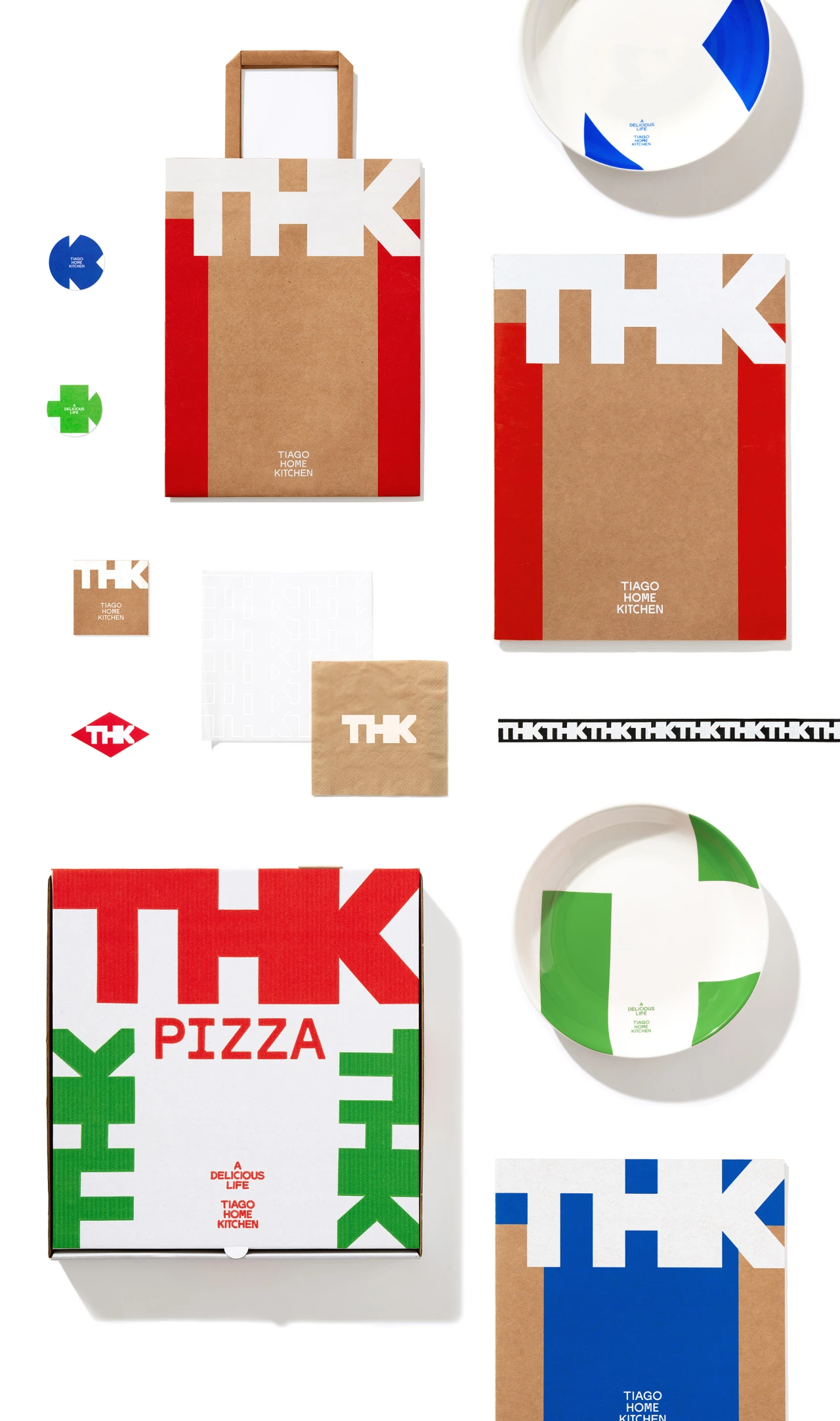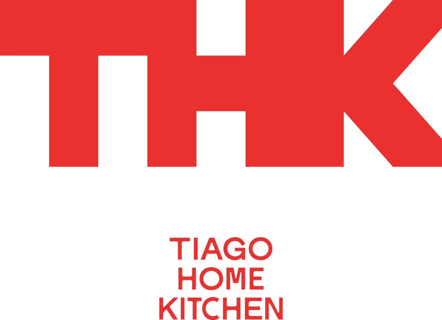
THK wanted to draw inspiration and pay homage to other aspects of Italian culture. The Visual identity inspired by Italin mid-century modern contours and forms. We wanted the THK lettering to exist almost as an object itself, a sculpture or an art piece. We wanted to give a nod to the robust boldness and warm tactility of mid-century modern furniture and designer goods. The word mark was thus as much about finding a form that reads both as a whole and as three letters.The mix of red, blue and green is primary, raw and humane. They have a sense of purity that is naive and approachable. They speak to THK dedication to delivering classic cuisine that is all about the taste of ingredients and tradition. Nothing fancy, fusion, or elevated, just good old pasta and pizza dishes, that are made of humble ingredients. We wanted our colors to reflect the love of food that is basic but just satisfying, understated but powerful at the same time.