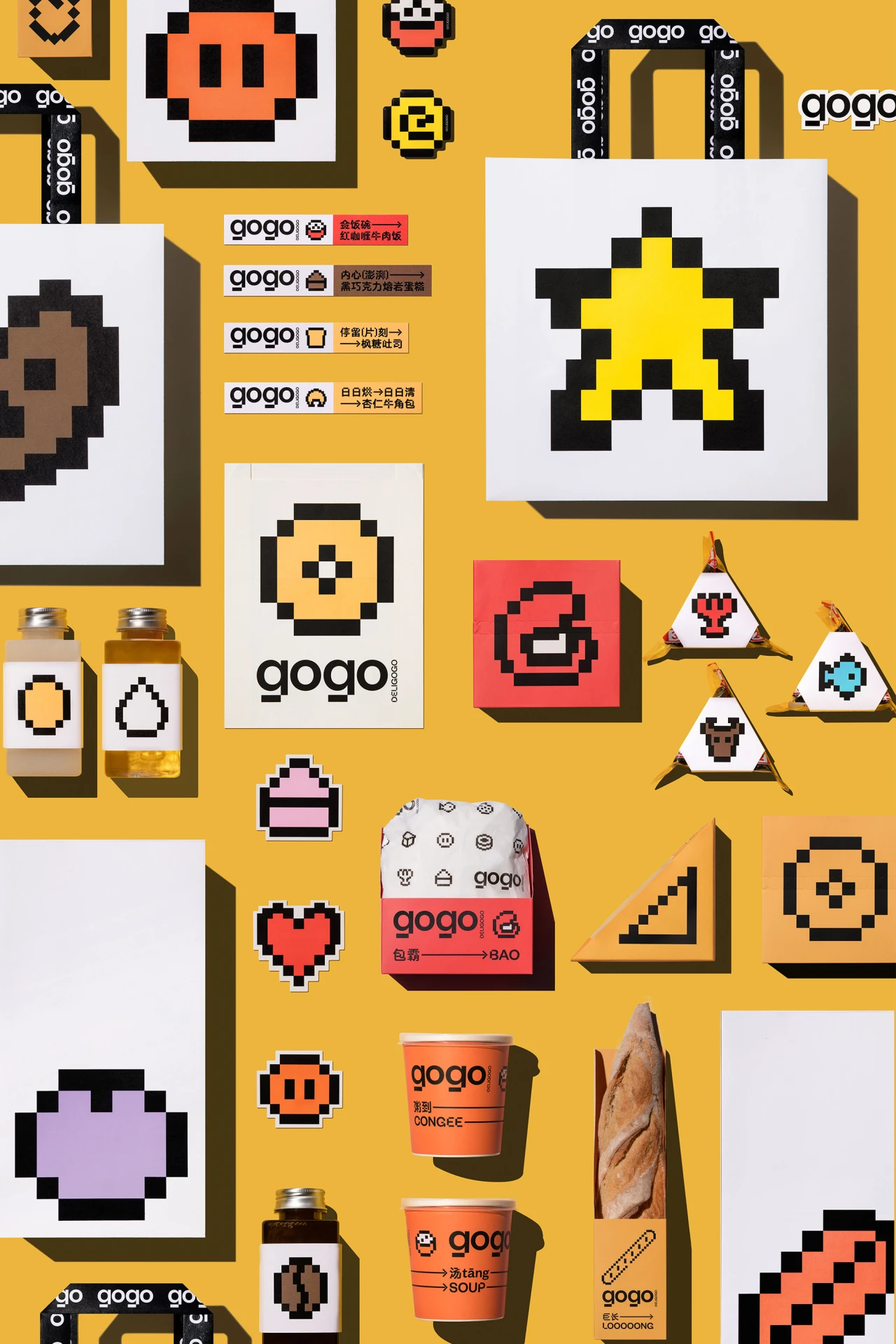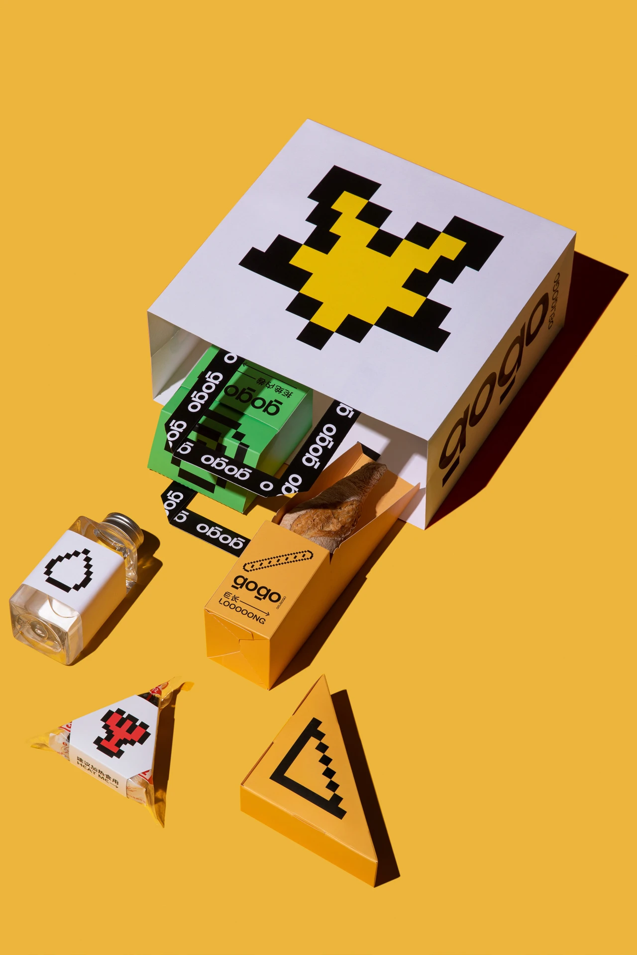
Convenience food as pixelated video game power-ups for Beijing store GOGO
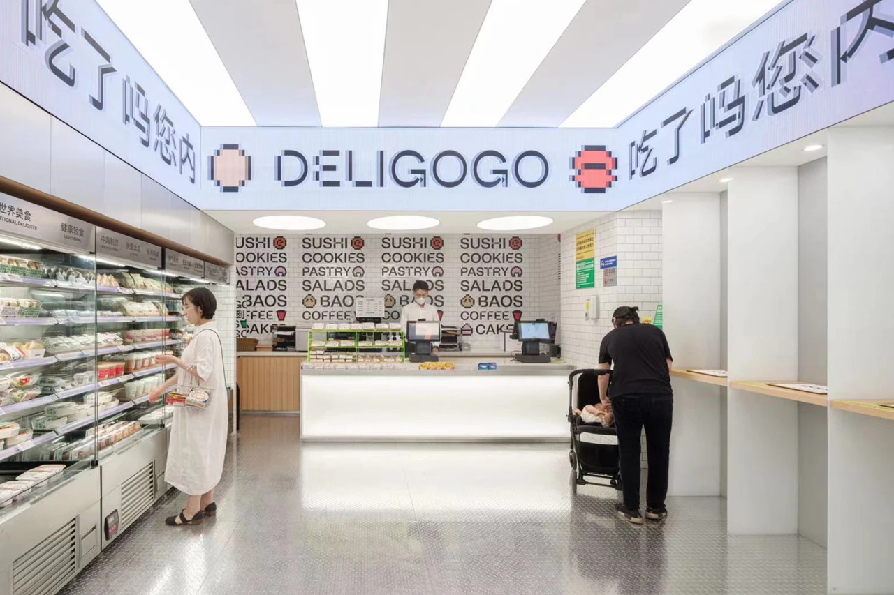
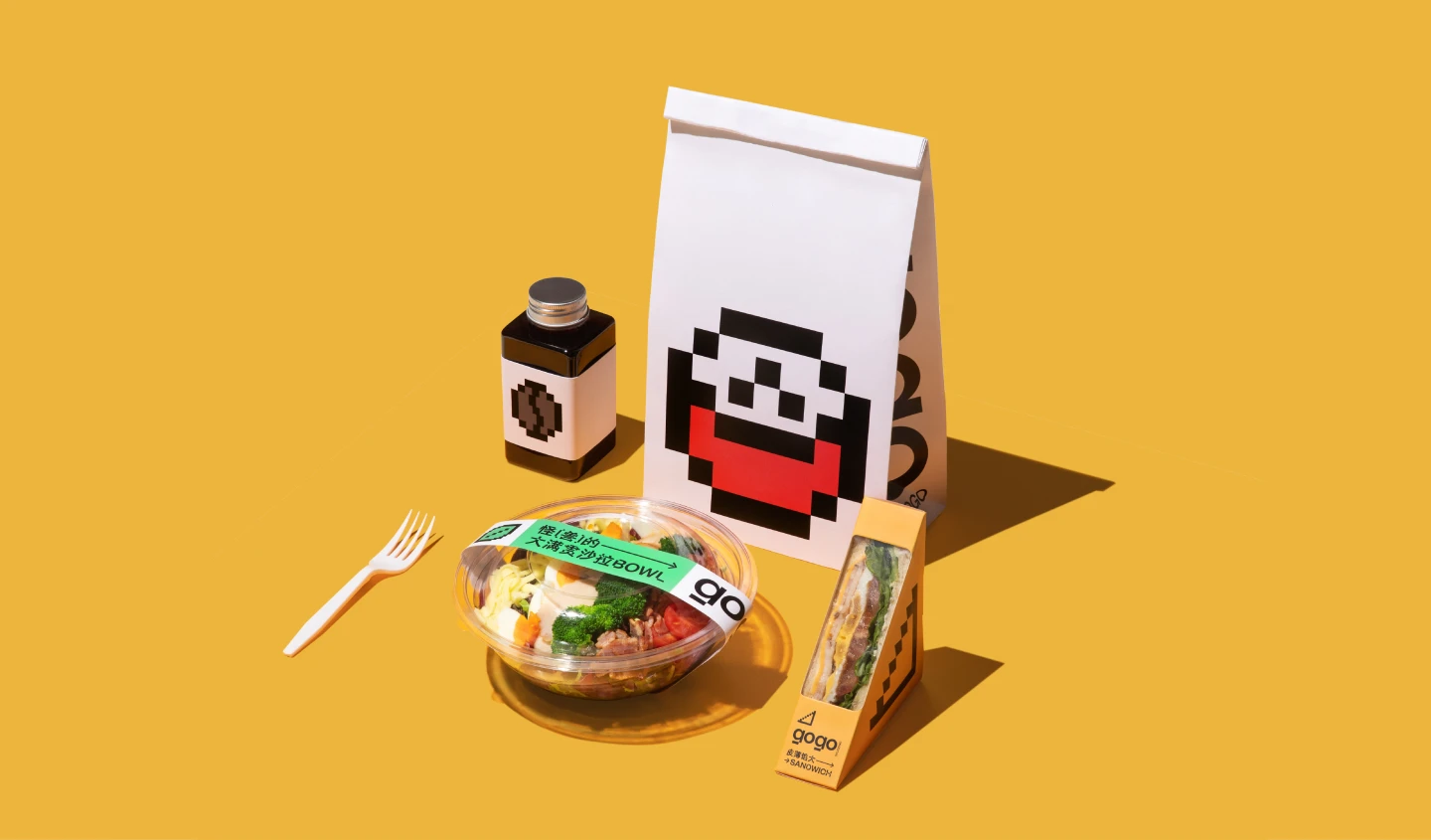
GOGO is a fast food and convenience brand created by the Beijing Subway. Launched in July 2021, it offers quick and easy meal options through mobile orders followed by in-store pickup, right in between stops of a workday.The design is inspired by the mundane daily commute of Beijingers, using graphics resembling pick-up items, or "buffs", for players in video games, replenishing commuters in their daily rush of the hyper city life.
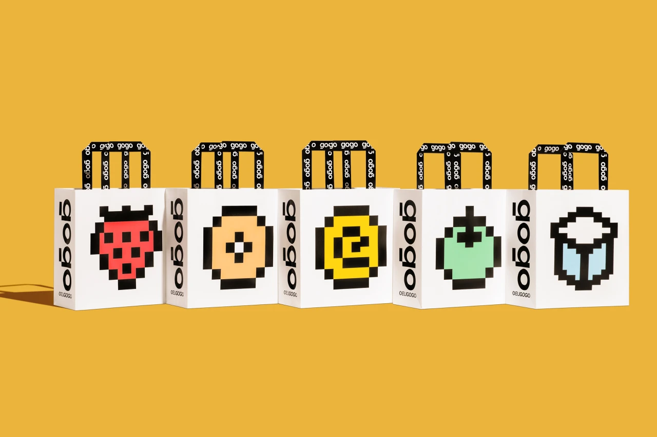
Using an 8x8 pixel grid, we visualized a series of icons that represented the brand's offerings.


The word-mark incorporates a “cut corner”, playfully highlighting the limitations of pixelation. It enables us make a lot of body type, making the type look special and fun.

From LOGO to icons, typography treatment to typography system, we employed the pixel language throughout all elements of GOGO’s branding, communicating youth, energy and playfulness.